Plots
In the last section, we made a simple scatter plot using a built-in plot method in EvilPlot. In this section, we’re going to explore some more built-in plots.
ScatterPlot: The Whole Story
If we take a look at the method signature for ScatterPlot.apply, we see it takes more than just data:
object ScatterPlot {

  def apply[X <: Datum2d[X]](   // Point extends Datum2d[Point]
    data: Seq[X],
    pointRenderer: Option[PointRenderer[X]] = None,
    xBoundBuffer: Option[Double] = None,
    yBoundBuffer: Option[Double] = None
  )(implicit theme: Theme): Plot = ???
}
Before, we passed the defaults for all parameters in ScatterPlot and let our theme determine how things looked.
But what if we want to color each point differently depending on the value of another variable? That’s where the
pointRenderer argument comes in.
A PointRenderer tells your plot how to draw the data. When we don’t pass one into ScatterPlot, we use
PointRenderer.default(), which plots each item in the data sequence as a disc filled with the color in
theme.colors.fill. But, there are a bunch more PointRenderers to choose from.
import com.cibo.evilplot.numeric.Point
import com.cibo.evilplot.plot._
import com.cibo.evilplot.plot.renderers.PointRenderer
import com.cibo.evilplot.plot.aesthetics.DefaultTheme._
import scala.util.Random

val qualities = Seq("good", "bad")

final case class MyFancyData(x: Double, y: Double, quality: String)
val data: Seq[MyFancyData] = Seq.fill(100) {
  MyFancyData(Random.nextDouble(), Random.nextDouble(), qualities(Random.nextInt(2)))
}
val points = data.map(d => Point(d.x, d.y))

ScatterPlot(
  points,
  pointRenderer = Some(PointRenderer.colorByCategory(data.map(_.quality)))
).xAxis()
 .yAxis()
 .frame()
 .rightLegend()
 .render()
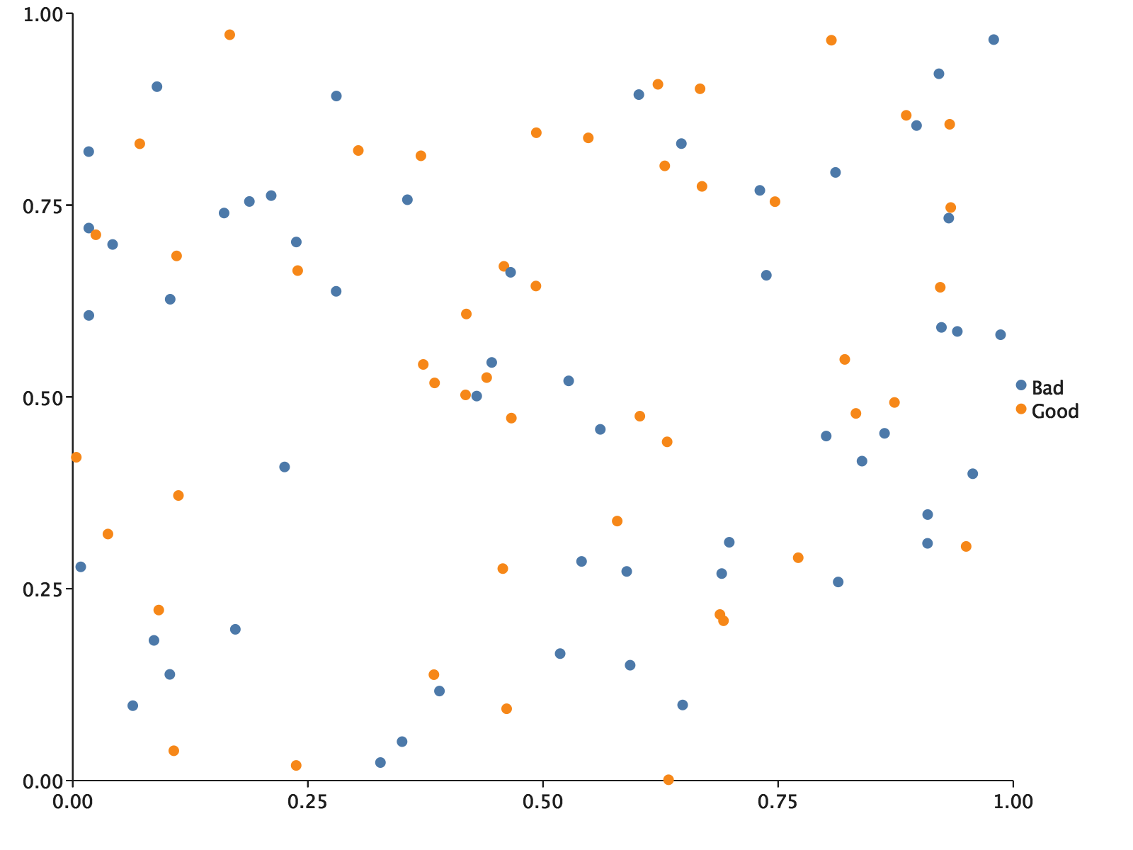
The colorByCategory point renderer handled our categories for us. You’ll notice we included a call to .rightLegend()
as well. The renderer is able to add our categories and their associated aesthetics to a context for a legend
automatically, so we get a legend that makes sense.
Overlaying
EvilPlot takes an unusual approach to overlaying, in the spirit of building more complex visualizations out of simpler
ones. When you want to make a multilayered plot, just make a plot for each layer. We then give you a combinator,
Overlay, to compose all the plots into a meaningful composite.
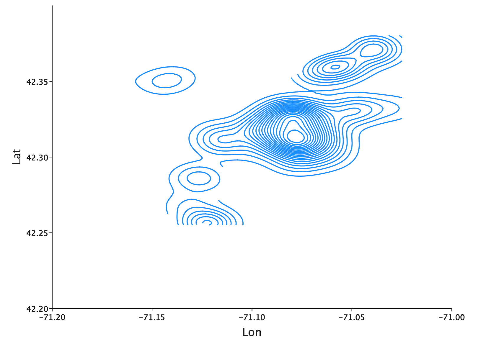
Let’s take a look at some real world data. In its natural state, real world data can be hard to interpret and even harder
to put to use. We will use Wicked Free WiFi, a
public data set containing the latitude and longitude (columns X and Y respectively) coordinates of several free WiFi
hotspots in Boston. After downloading the CSV file, let’s parse the data into a Seq[Points]:
import com.cibo.evilplot.numeric.Point
import scala.collection.mutable.ArrayBuffer
import scala.io.Source

val path: String = //Insert your path to saved CSV file
 val data: Seq[Point] = {
    val bufferedSource = Source.fromFile(path + "wifi.csv")
    val points = bufferedSource.getLines.drop(1).map { line =>
      val columns = line.split(",").map{_.trim()}
      //The coordinates are found in the first and second columns
      Point(columns.head.toDouble, columns(1).toDouble)
    }.toSeq
    points
  }
Now that we have our data in a usable form, let’s make a contour plot to show the general density of free WiFi locations throughout Boston:
import com.cibo.evilplot.colors._
import com.cibo.evilplot.plot._

def contourPlot(seq: Seq[Point]): Plot = {
    ContourPlot(
      seq,
      surfaceRenderer = Some(SurfaceRenderer.contours(
        color = Some(HTMLNamedColors.dodgerBlue))
      ))
}

contourPlot(data)
    .xLabel("Lon")
    .yLabel("Lat")
    .xbounds(-71.2, -71)
    .ybounds(42.20, 42.4)
    .xAxis()
    .yAxis()
    .frame()
    .render()
How can we make use of this plot? To start, we can add points for reference using EvilPlot’s Overlay. Let’s add a
reference point at (-71.081754, 42.3670272), the approximate location of CiBO’s Cambridge Office.
Overlay(
      contourPlot(data),
        ScatterPlot(
          Seq(Point(-71.081754,42.3670272)),
          pointRenderer = Some(PointRenderer.default(color = Some(HTMLNamedColors.crimson))))
      ).xLabel("Lon")
        .yLabel("Lat")
        .xbounds(-71.2, -71)
        .ybounds(42.20, 42.4)
        .xAxis()
        .yAxis()
        .frame()
        .render()
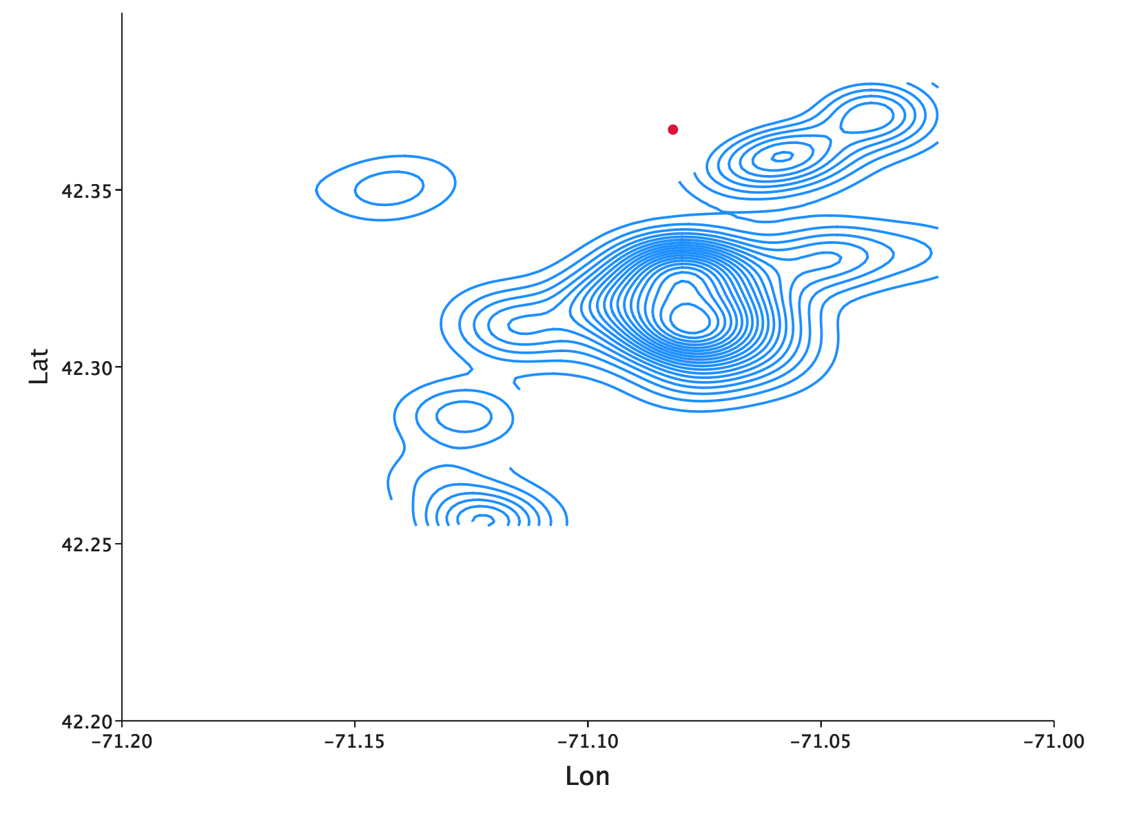
The Cambridge office location is just north of the central city of Boston, so this reference point serves as an easy
check to make sure that we rendered the plot rendered correctly. With Overlay, we don’t have to worry that the bounds of
our plots might not align–EvilPlot will take care of all of the necessary transformations for you.
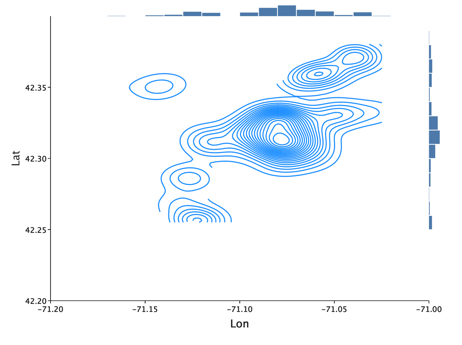
Adding side plots
The contour plot gives us a good glimpse at the bivariate distribution. But, let’s say we were secondarily interested in looking at the univariate distribution of each geographic coordinate. Of course, we could just make histograms.
val lonHistogram = Histogram(data.map(_.x))
val latHistogram = Histogram(data.map(_.y))
But we don’t have to stop at plotting these separately. EvilPlot will let us place plots in the margins of another plot using a whole family of border plot combinators. If we take what we’d been working on from before:
contourPlot(data)
        .frame()
        .xLabel("Lon")
        .yLabel("Lat")
        .xbounds(-71.2, -71)
        .ybounds(42.20, 42.4)
        .xAxis()
        .yAxis()
        .topPlot(Histogram(data.map(_.x)))
        .rightPlot(Histogram(data.map(_.y)))
        .render()
Faceting
Plotting WiFi locations is helpful, but what if we have even more data that we want to compare and plot using the same
axis? EvilPlot’s faceting lets us compare several plots at the same time. Let’s grab data from
Snow Parking,
Water Playgrounds,
and Polling Locations and compare their respective
contour plots. For the below example, load each of the CSVs into their
own Seq[Point] and add each of them into a Seq[Seq[Point]] called allData in order, so that WiFi is first, then
snow parking, then water playgrounds, then polling locations.
Facets(
    Seq(allData.take(2).map(ps =>
        contourPlot(ps)
          .topPlot(Histogram(ps.map(_.x)))
          .rightPlot(Histogram(ps.map(_.y)))
          .frame()),
      allData.takeRight(2).map(ps =>
        contourPlot(ps)
        .topPlot(Histogram(ps.map(_.x)))
        .rightPlot(Histogram(ps.map(_.y)))
        .frame()))
  )
    .topLabels(Seq("Family Outing", "Snowy Election"))
    .xbounds(-71.2, -71)
    .ybounds(42.1, 42.4)
    .xAxis(tickCount = Some(4))
    .yAxis(tickCount = Some(4))
    .render()
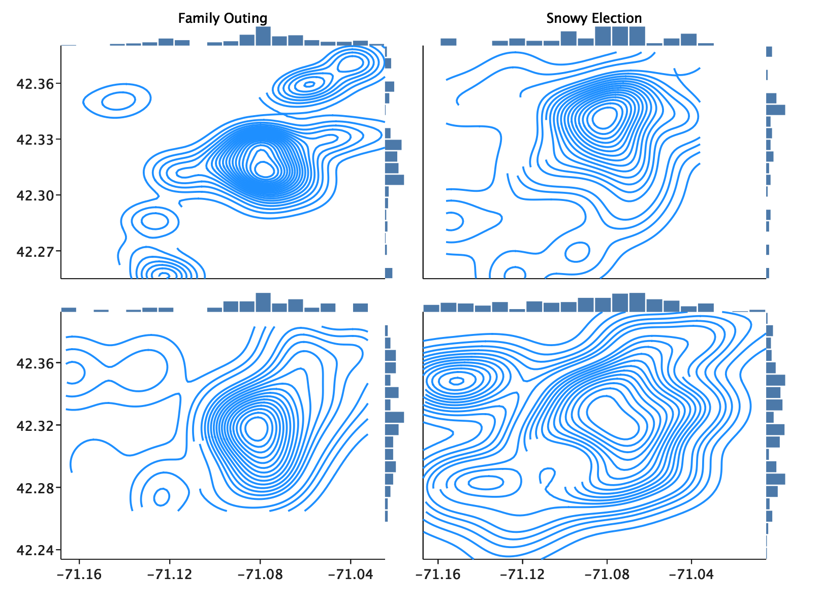
Hopefully at this point we can start to draw some useful conclusions from our data. Interested in a low-key family outing? Your best bet is to search in an area with a high density of both free WiFi and water playgrounds! Did the Boston winter hit a little sooner than expected? No problem. Just look for a polling center near a highly dense emergency snow parking area.
These examples are a little contrived, but now you know how to start with a simple visual and compose more and more complexity
on top of it using plot combinators. We first saw that the base plot can be customized using PlotRenderers. After that
we saw how simple Plot => Plot combinators can add additional features piece-by-piece. Next, we saw that
“multilayer plots” are expressed in EvilPlot simply by applying Overlay, a function from Seq[Plot] => Plot.
Finally, we saw how we can build a multivariate, faceted display out of other plots easily, regardless of how
complicated the individual plots are.
But, we’re just getting started. Check out the Plot Catalog for awesome examples of what you can do with EvilPlot. Or, read about the drawing API for some background before venturing into writing your own renderers, which is an easy way to make EvilPlot even more customizable.